© 2026 ALLCITY Network Inc.
All rights reserved.

“If you look good, you feel good. If you feel good, you play good. If you play good, they pay good.” ~ Deion Sanders
For their entire history, the Colorado Rockies have relied on the same default home and road uniforms, barring the 11-year span they tried a woeful gray version of the purple pinstripes so ill-advised that they reverted to the originals. They’ve dabbled in creativity with their alternates, and have bought into the specialized uniforms the league churns out to sell more merchandise.
As the Blake Street Bombers enter their 25th season, they will don special caps with gold trim and special patches on their jerseys. But, these announcements, although fairly exciting on their own, were not the important ones.
If you somehow haven’t seen it already, behold, heaven in a baseball cap:
The @Rockies have a new BP / Spring Training hat for 2018. What are your thoughts? pic.twitter.com/9n0GHP9o1U
— Baseball Essential (@BB_Essential) November 20, 2017
The new hat, emblazoned with the cult-followed flag, is worn during batting practice and has become a staple of the Rockies’ spring training uniform. The iconic “C” and its colors stand for the state’s soil, sunshine, and snow-capped mountains. If that imagery doesn’t get you excited for a new season of Rockies baseball, I don’t know what will.
But where does it put the spring training getup in the hierarchy of Rockies uniforms?
18. 2007-2009 batting practice/spring training uniforms
It’s unfortunate that perhaps the most memorable three seasons in Rockies history were accompanied by these failed experiments. Especially following the National League championship run in 2007, the images of spring training should have conveyed hope and a bright future. Instead, we had white and purple arrows pointing at armpits, making the team’s signature color look like a visit-to-the-doctor worthy stain.
The redeeming feature is the purple trim on the caps, which are done an incredible disservice by having to share a locker with those jerseys.
17. 2000-2011 road grays
My disdain for these uniforms knows no end. It really is like the cliche tale of the designer forgetting he needed to design a road uniform too, and just making the home ones gray and replacing ‘Rockies’ with ‘Colorado.’ Especially after the aesthetically-pleasing piping uniforms the team wore for their first seven seasons, that they returned to after this decade-long debacle. The only question is, what took so long?
16. 2003-2006 batting practice/spring training
The fascination with shoving flair into the armpits of players is amazing to me. While both basic jersey designs were league-wide with this design and the aforementioned 2007-09 one, some teams opted not to shove colors under their players’ shoulders. And oh boy, the gray brim makes zero sense.
The white piping is strong though, and the purple numbers would be great on any color other than black, a lesson the Rockies learned.
15. 2011-2013 batting practice/spring training
At least the purple isn’t totally concealed on this one. Nothing super exciting here, but definitely bought one of the hats for the piping and brim trim. These even found their way into a regular season game on June 22, 2013, for some reason.
14. 2002-2004 pinstripe CR alternates
One of the biggest complaints about the Rockies’ uniforms I hear is that they don’t distinguish themselves from legacy franchises like the Chicago White Sox and New York Yankees. This is valid, especially with these three-season specials that the South Siders have worn since 1991, almost down to the logo design. That said, it worked for the Sox and it worked for the Rockies, too.
13. 2014-present batting practice
The league-wide uniform designs, we have learned, are not particularly cohesive with the Rockies brand theme. With the persistence of the Rockies to keep black as the primary, they tarnished their ability to cash in on being the only team to use purple (other than the one good Arizona Diamondbacks uniform). Fortunately, they finally remedied this in 2016, when they introduced the all-purple tops for spring training, relegating this to a batting practice role.
The purple backs are strong though, at least finally not hiding the team’s unique selling point between torso and arm. The gray numbering works, too. Plus, it introduced us to the mountain logo on caps, which was a fantastic step in the right direction.
12. 2005-2011 pinstripe vests home alternates
Where the Rockies failed to find their spin on the White-Sox-esque pinstripes in 2002-2004, they hit a niche in 2005. Some people say vests don’t belong in baseball. Those people are wrong.
Where the black vests go wrong (which we’ll get to in a minute) is not having linearity in the undershirt. These vests and their black, short sleeve compliments gave the Rockies their own angle on pinstripes. Rockies baseball is weird. The ball travels farther in Coors Field. The team’s best season came from a tie for a wild card seed, not a division title. Dinger. Having a unique, diverse jersey while still maintaining traditional uniform elements should have been lauded.
11. 2012-present road grays
The piping is good, and an immediate improvement over the terrible pinstripe road uniforms. The purple pipes, trim and lettering are the most uniquely Rockies the team has ever gotten. The only reason this one is ranked lower than the previous iterations of the same uniform is the subtle details.
10. 1993 road grays
The only advantage of the inaugural grays over the modern version is the double piping on the arms and the distinctly retro white trim on the lettering that is a lot less defined. Were it not for nostalgia, this might be swapped with the current ones on this ranking. But, these must’ve been a pleasant introduction to the world of Rockies baseball.
9. 1993 home pinstripes
We already talked about not standing out from the crowd. One way to look exactly like the Yankees is to take their uniforms and change the name on the front. The Yankees have the history of existing before applying names to uniforms was practical. The Rockies do not. In 1993, with a completely new roster that the fans wouldn’t have been able to recognize by number, at least not immediately, names were easy and probably necessary. Fortunately, this was corrected the next season.
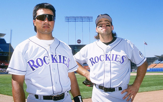
8. 1994-1999 road grays
(Photo Credit: Getty Images)
This variation of the road uniform gets the edge over the other two just because the purple printing of ‘Rockies’ is perfect, and died with the road pinstripes. The solid purple is perfectly ’90s and exactly what an expansion franchise trying to find its face needed. I mean, look at the mullet.
7. 2005-present black vest alternates
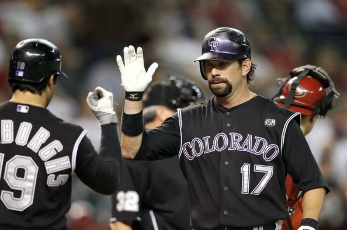
(Photo Credit: USA TODAY)
Hot take incoming: the black vests are good. The white-on-black is executed so well. The issue, as previously stated, is the exuberant athletic undershirts that have their own design schemes, often with piping or gray components that make the Rockies look as on the same page as a class of high school students being asked to read Shakespeare. Any kind of uniformity on that front, and these shoot up the list. Maybe a return of the short-lived purple undershirt.
Plus, the memories in this uniform. Looking at you, game 163.
6. 2016-2017 spring training
Getting away from the black spring training scheme was a necessity. As child-like excitement builds for a new season and the hopes of spring and warming temperatures, the Rockies and purple should have been synonymous with ushering it in. Black jerseys are good and underappreciated, just not in March. Seeing the images online of black uniforms down in Arizona didn’t convey the imagery like so many other teams’ apparel did. In 2016, it finally happened, and the full purple tops with the mountain logo caps became the indicator of baseball to come. Throw in the updated purple in 2017, and the colorful vibes hit a new level.
5. 2018 spring training
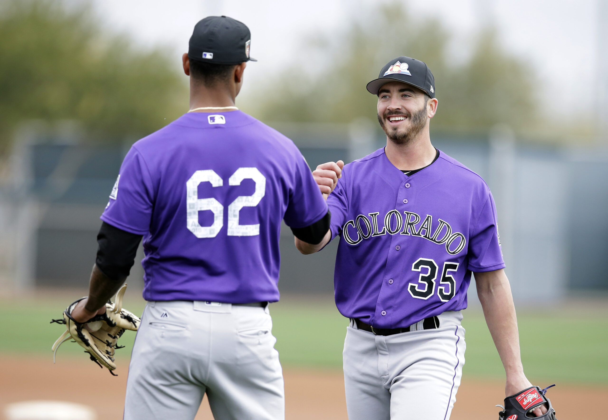
The hat. The jersey did not change, but the 2018 spring training uniform earned its own entry just because the lid is one of the best in the sport. I’ve long said professional sports teams in Colorado should be required to have some form of state branding. The Avalanche did, now so have the Rockies. The Colorado State University Rams football team nailed their state pride uniforms.
Looking at you Broncos and Nuggets.
4. 1994-1999/2000-present home pinstripes
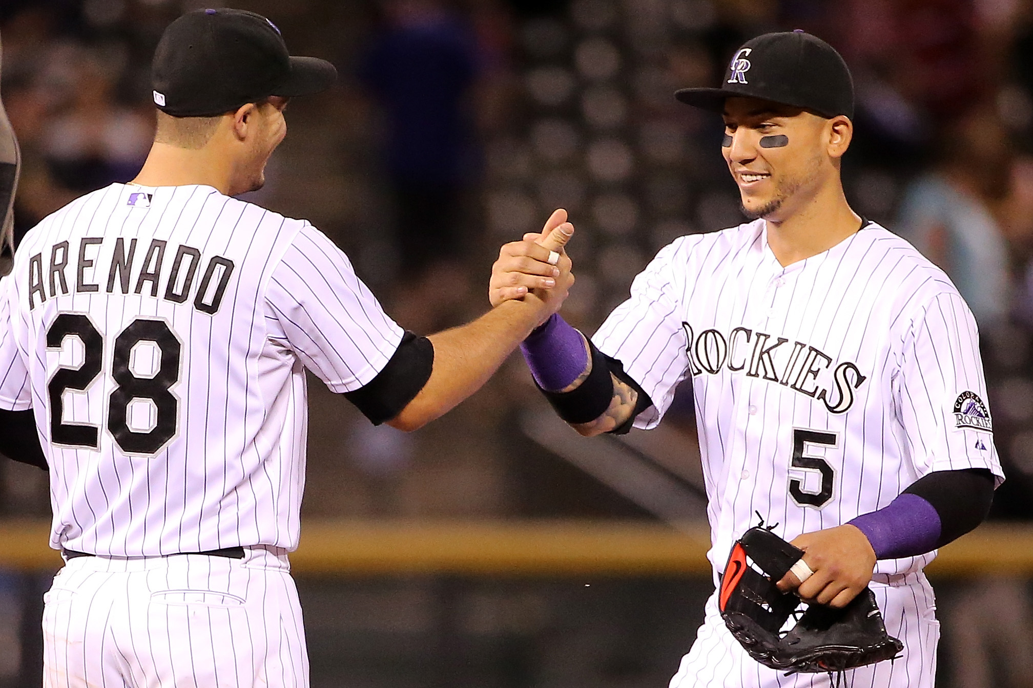
They might not have anything extraordinary going on, and they may look like several other teams’ uniforms, but they are Rockies baseball. The purple pinstripes are the team’s identity, and the reason the look has stuck for other baseball clubs is that it works. Pinstripes don’t work in hockey, football or basketball. They do in baseball, and they do in magenta and in Coors Field.
3. 1993 black alternates
I can’t quite place why, but these are perfect. The purple lettering is nailed, even with the dark-on-dark scheme. Like the 1994-99 road jerseys, they were outlandish enough for the decade and built up the brand of the Rockies. They’re distinct.
2. 1999 Turn Ahead the Clock
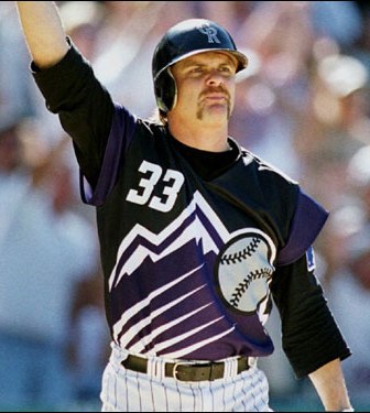
Since the Rockies already play in space, it is time for the Turn Ahead the Clock promotional uniforms to be instituted as a full-time alternate. Look at the mountain logo. The sleeves, for lack of a better description of the purple shoulder pads. The vertical name. It’s all crazy, unique and fun. Although, I’m not sure it would stand up to the “Saltalamacchia” test.
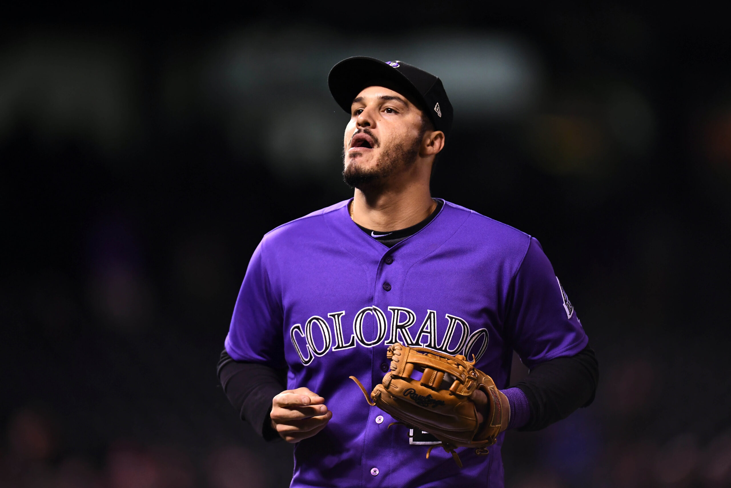
1. 2000-present purple alternates
Could it be anything else? The purple is the staple of the Rockies. Since the revamping of the color scheme in the 2016-17 off-season, it’s become more engraved in the team’s image, as it should. Since the implementation of Purple Monday, the team is finally banking on what makes it stand out, and where the singular experience that is Rockies baseball can be defined.
 (Photo Credit: USA TODAY)
Comments
Share your thoughts
Join the conversation


