© 2026 ALLCITY Network Inc.
All rights reserved.

NBA uniforms are a perpetually evolving — and sometimes devolving — fashion statement. Some are immaculate and some… not so immaculate. The Nuggets have been blessed to have some pretty awesome uniforms and logos throughout their history. The skyline series from the 80’s is often seen as the peak of not only Denver Nuggets uniform history but of NBA jersey and logo design all together.
A few years back the Nuggets introduced their yellow Marquette-style alternates to universal acclaim — and rightly so. Fans had been begging for years to reinvent the skyline design in some sense and after two and a half decades the team finally got back in touch with its rainbow roots.
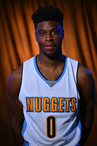
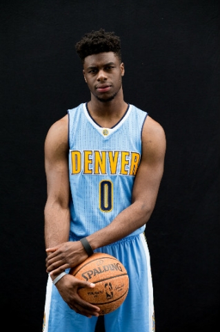
Three years later and the Nuggets are back at it, this time tweaking the design of their home unis. Take a look below…
 So what’s the verdict? Are they good? Bad? OK? Just in need of some minor tweaking or rather a complete overhaul?
To be honest I’m somewhat indifferent. On one hand I really don’t notice much difference between these new uniforms and the old ones, so in the grand scope of covering the Nuggets and watching this team play on a nightly basis this really won’t sway me too much either way. On the other hand I do wonder where in the world the dark swatch for the numbers comes from. Is that black? Dark navy blue? It’s hard to tell. No matter the case, it doesn’t match the overall color scheme at all. That dark of a color has never been a part of the Nuggets uniforms so it’s a bit difficult to understand why the team decided they suddenly needed it now.
But, thus is the world of art colliding with billion-dollar corporate interests. I never thought in a million years the Oklahoma City Thunder’s uniforms and logo would actually become a real thing when I first saw them leaked on the Internet six years ago, and yet here we are entering the 2015-16 season and Clay Bennett still has absolutely zero problems with the fact his franchise logo has the color combination and design of a sticker you’d pull from a 50-cent vending machine at Golden Corral.
What are your thoughts on the Nuggets’ new uniform designs? Feel free to opine in the comments section below.
Comments
Share your thoughts
Join the conversation


