© 2026 ALLCITY Network Inc.
All rights reserved.


In case you missed the Introduction/Basic Advanced Stats Guide, check it out here.
Once you have an understanding of the principles and typical stats that might come up in every day hockey watching/reading, the next step is to dig in and do some analysis for yourself.
Don’t worry! There are some great resources out there like Natural Stats Trick, Puck IQ, and Corsica. Plus, if you can add, subtract, multiply, divide, and understand how to find a percentage and a rate, you’ll have no problem figuring out how most of these stats are calculated. And if you watch hockey, play shinny, or know much of anything about the sport, the terms are fairly easy to grasp.

A few notes on using these stats:
None of these numbers can paint a full picture of a player alone. Even though there are some new stats that are working towards that goal (more on that in part 3), these stats each tell a part of a story. Figuring out how the pieces fit together is where the user analysis comes in.
Most of these measures have been around for a while, so there’s quite a bit of additional research on them. This guide aims to provide a working knowledge, but there’s plenty that can’t be covered, including testing processes and in depth case-study examples. Hockey-Graphs, Outnumbered, the Corsica Blog, and the War On Ice blog are great resources, and don’t discount Google or Twitter.
Don't like ads?
If you want an overview before we begin, I’d highly suggest reading Corsica’s Getting Started with Hockey Analytics and at least skimming their Glossary page.
Adjustments:
In Part 1, Corsi and Fenwick were introduced as alternatives to the troublesome plus/minus. Both stats are descriptive of what’s happening on the ice in the form of shots on goal, missed shots, and in Corsi’s case, blocked shots. However, they also have some predictive value and do better job of forcasting goals than goals themselves.
Unfortunately, in their raw forms, their predictive value is still not great. Those numbers lack context and don’t account for any of the other variables happening in the game. There are still some adjustments that need to be made before you can get a strong sense of how well a player/team drives possession.
Corsi For/Against Raw Counts: Before we dig too far into adjustments, let’s talk a little bit more about raw Corsi.
The metric commonly referred to as Corsi is actually the Corsi For %, or what percent of Corsi events were in the team’s/player’s favor. However, the stat can be (and often is) broken down into its raw components of Corsi For and Corsi Against, which provide further context.
Even without much predictive value, these numbers are still worth a peek to see if trends emerge. For example, are there a lot of events happening while this team/player is on the ice, or do they lock play down and create relatively few?
Don't like ads?
Relative Corsi (RelCF): Trying to compare players across teams is difficult because players on bad teams tend to have bad Corsi and players on good teams tend to have good Corsi. Instead, it’s more useful to look at where they stack up vs. their teammates when it comes to generating events for and against.
In order to be able to do this, we need to first understand the difference between On-Ice and individual stats, as well as the per 60 rate.
- i (stat) denotes an individual measure of a stat. It looks at only the player’s created events, not player’s + teammates’.
- On-Ice is a teammate based stat. When a player has an event, he AND his on-ice teammates get +1. Same goes for events against. Plus-minus is a good example of an on-ice stat.
- All “against” measurements (like Corsi Against) and PDO are on-ice stats, because they inherently depend on other players on the ice. You can’t individually shoot against yourself, so there is no such thing as individual Corsi Against.
- Off-Ice is the opposite of on-ice, or what a player’s teammates or opponents are doing while he’s on the bench.
- (stat)/60 is the rate of a stat per 60 minutes (one full hockey game). This makes it easier to compare high & low TOI players.
Relative Corsi is an on-ice per 60 vs. off-ice per 60 measure. If a player’s average on-ice Corsi per a 60 minute period is +6, it means he helps his team generate six more shots at net than the opposition during that hour. However, if his teammates are +8 while he’s on the bench, he’s still doing worse than the rest of his club at generating offense. The player in question would therefore have a -2 relative Corsi.
5v5 or Even Strength (ES): full strength, five skater vs. five skater hockey. While special teams do play an important role in the outcome of games, 75% of the sport is played at even strength. At evens, both teams have the same number of players and the roughly same amount of opportunities, so only looking at 5v5 events removes a lot of the data-skewing potential of special teams and other odd strength states.
Even if you make no other adjustments to Corsi, Fenwick, or any other stat, adjusting to even strength only will make it significantly better at predicting future success. Luckily, most stats sites present 5v5 data as a default, but it’s always worth making sure.
Score and Venue Adjustment: Hockey teams tend to play differently when they’re leading or behind. If they’re winning the game, clubs are more likely to play defense-first hockey and stop taking offensive risks, whereas losing teams will press the play and take shots from everywhere in hopes of getting a lucky break.
Don't like ads?
When you’re looking at shot-based stats, these situations can greatly affect the data. One team might outshoot another, but if that team was down by two five minutes into the first period, trying to make up for it by outshooting the other club still isn’t a recipe for long-term success.
That’s where score adjustment comes in. There are a couple ways to handle it. The first involves looking only at data that fits a criteria, like when the team is Leading, Tied, or within one goal before the third period or tied during the third (Close). Unfortunately, every time you largely cut down on your data size, you lose a lot of the bigger picture. Some stat sites still use this method, but many have moved away from it.
The other alternative was devised by Micah Blake McCurdy (who is the godfather of hockey visualizations, a great twitter follow, and someone we’ll talk about later in this guide). He built on an idea from Eric Tulsky and looked at all the Fenwick events from 2007-2014 and broke them down by the home team’s relative score (leading by 1 goal, trailing by 3, etc.). He then figured out a coefficient that weights each Fenwick event by how likely it is to occur.
For example, a home team trailing by 2 goals and bolstered by both desperation and the support of their fans is on average 15.4% more likely to get a shot than their opponent. So, by score adjusted Fenwick, those events only count as .882 of an event (1 – .154), both because the team is expected to shoot more and as a penalty for being down by 2.
This method keeps the full sample size of Fenwick from the game (which makes it more accurate), while equalizing the effect to get a better idea of the true talent of a team. Also, since it accounts for the fact that home teams tend to put up more shots than visiting teams as well, it’s typically refereed to as Score and Venue adjustment.
McCurdy also did a follow up article later where he looked at Fenwick, Corsi, and a number of different adjustments. Even though his original research used Fenwick, he determined that Score & Venue Adjusted Corsi was the most repetitive and predictive of both goals and wins.
Don't like ads?
So, when trying to make judgments about possession, the best way to narrow in on a good predictive number is to always look at Corsi, then adjust for strength state (making it all 5v5 data), then adjust for score, then adjust for venue. The first steps have the biggest effect on the data, but each subsequent set moves it closer to the target.
Zone Adjusted:
There is one other adjustment that some sites (including Corsica) use, which is zone start adjustment. (For the record, Natural Stats Trick ignores it, choosing to only adjust for score/venue.)
Just like with Score/Venue adjustment, there are a couple different ways to go about this. One is to look at how likely a Corsi event is to occur after each shift start, including on-the-fly ones.
For example, if a player helps generate an offensive Corsi event after starting in the defensive zone, historical trends determined that those Corsi events should have a weight of 1.25 due to how rare and difficult they are to accomplish.
Unfortunately, this weighting didn’t shift the author, Matt Cane’s, numbers much. Boyd Gordon, a player typically praised as being one of the best defensive forwards during the 2008-2015 data period, only saw his raw Corsi percentage improved by 2.6%. Manny Malholtra was bumped only 2.2%, and most players saw a negligible difference.
The other zone start adjustment system simply removes events taken a certain amount of time after a faceoff. The idea is that hockey is such a fluid and fast game the advantage (or disadvantage) to starting in a particular zone goes away after a few seconds.
Don't like ads?
While some have set that threshold at 10 seconds, Corsica chose to use 20 seconds. They combine their score/venue/zone adjustments, but the full list of coefficients can be found here.
Weighted Shots: Corsi isn’t the only stat that can be weighted based on venue and score concerns. Weighted shots is goals + (0.2 * Corsi). It’s correlation to future goals is very similar to Score/Venue adjusted Corsi, plus it happens to be a little easier conceptually to understand.
Context Stats:
With or Without You (WOWY):
WOWY is somewhat similar to relative Corsi, but instead of looking at how good a player is in comparison to the rest of his team, it looks at how he affects/is affected by his linemates. The stat compares the even strength Corsi of the players when they’re on the ice together with their Corsi when they’re apart.
Good players will tend to increase the output of those on the ice with them, where bad players will act as anchors and drag everyone else down. Figuring out which is which is especially important for bad teams, as the raw numbers for everyone tend to be awful.
For example, Nathan MacKinnon’s most common linemate was Mikko Rantanen last year. They played 682:28 together and 387:31 away from each other at even strength. When they were on the ice as a unit, they posted a 50.19 Corsi For %. When MacKinnon was away from Rantanen, he had a fairly similar Corsi at 49.79%, while Mikko dropped to a less than outstanding 43.73%. (average Corsi is 50%)
Don't like ads?
But it’s not enough to look at one player. Where WOWY really helps is with overall trends. For example, in this graph, MacKinnon alone is shown in blue, his teammate alone is shown in red, and together they’re shown in black.
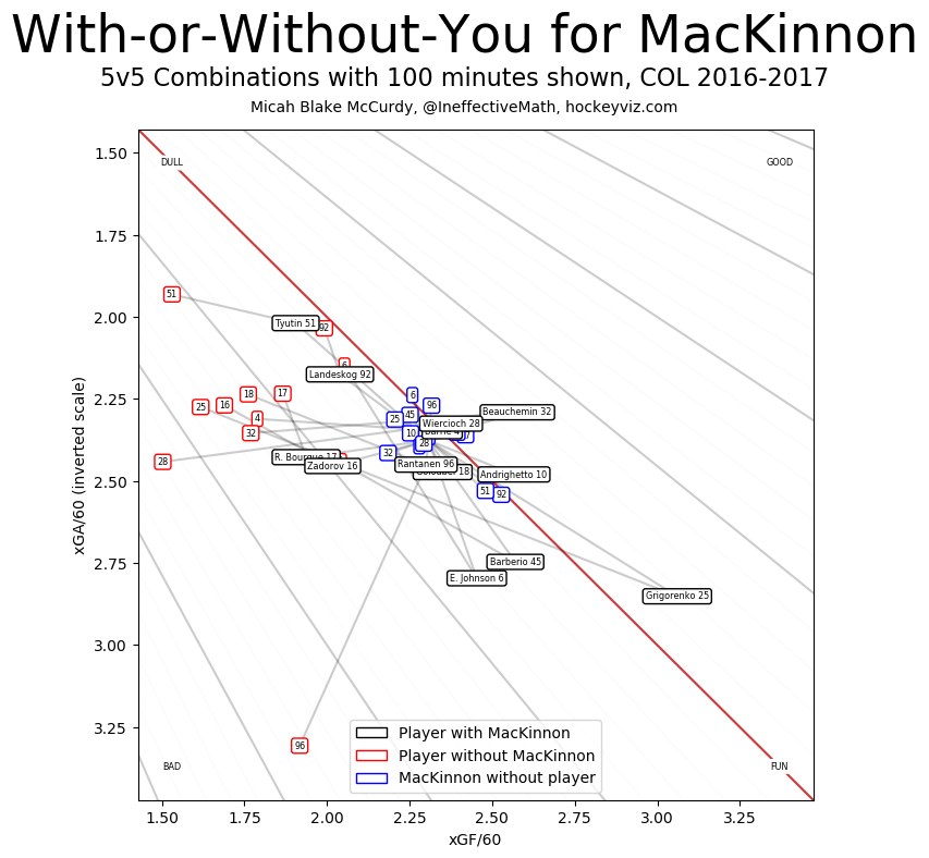
MacKinnon, although his Corsi is only okay, makes everyone on his team better on offense when they skate together.
Likewise, here’s Rantanen’s WOWY graph.
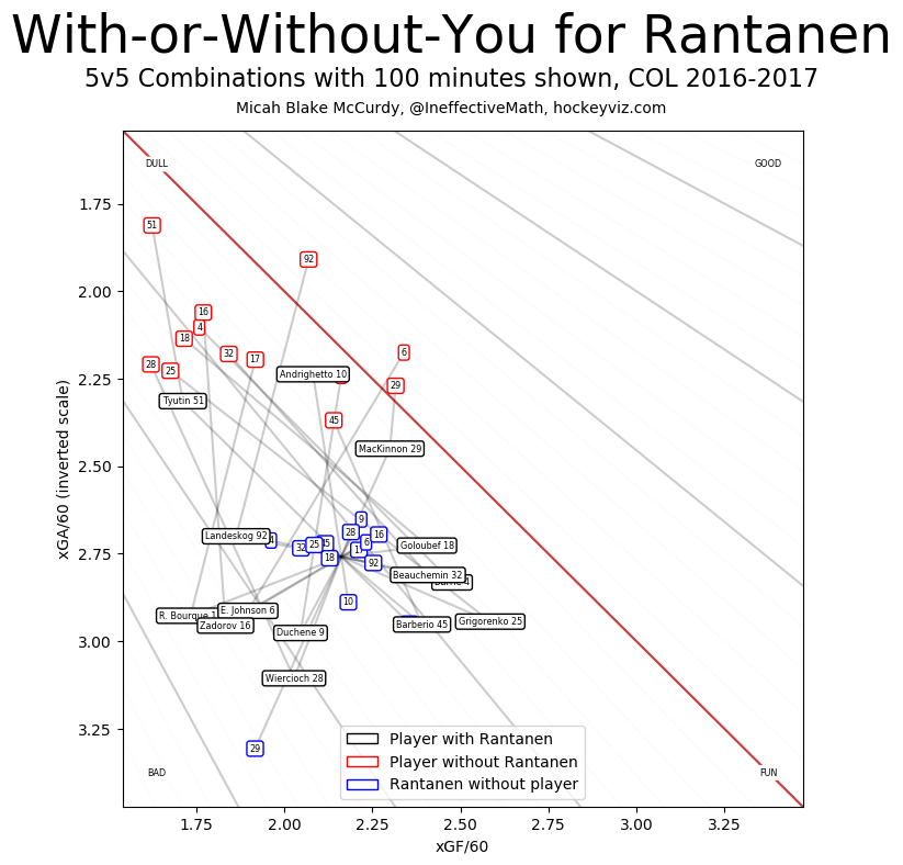
Rantanen makes everyone he plays with worse defensively. As a rookie, this is to be expected, but it is something to consider when talking about his performance last year.
He scored 20 goals, which is great, but his teammates were more likely to get outshot when they were on the ice with him. MacKinnon, who he spent two thirds of his season with, didn’t see a similar trend, which indicates MacKinnon had a very strong positive influence on Rantanen’s play, not the other way around.
QoT (Quality of Teammates)/QoC (Quality of Competition):
Don't like ads?
One reason player’s WOWYs can differ is quality of teammates and quality of competition, or how good are the players they’re playing with and against. Both are stats that have been around for a while, but in their current form, they’re a bit problematic. We know these factors exist and are important, but there’s not one set way to quantify it.
Right now, there are three major methods for determining QoC and QoT. The first looks at ice time, since better players tend to play more minutes. The next looks at Corsi, since better players drive play and will typically have a higher Corsi For percentage. The last method looks at player’s expected goals (xG), which is a stat we’ll cover a little later in this guide.
In any case, QoC and QoT look at how big of a number your opposition/teammates put up in each category over the course of a season. The bigger the number, the better players you’re playing against/with.
The problem with quality of competition is, surprisingly, most everyone plays everyone else in the NHL. Shift changes happen at staggered times, and home teams get the chance to match who the visitors put on the ice at faceoffs. In the end, by each of these measures, there’s not a great deal of difference in the QoC number between career 1st line players and career 4th line layers.
There’s also a problem of survivorship. Instead of a nice pretty bell curve like you’d expect, bad players who are outliers in each of those three areas are kicked out of the league. As a result, the NHL has a few really good players, a lot of middle players, and very few bad players. When so much of the player population is in the middle, it makes it hard to get noticeable changes in the data.
However, when looking at one-on-one and short-term situations, there are some odd phenomenon that occur. For every 1% increase in the competition’s Corsi, the observed Corsi of the player in question will drop by 1.5%. It doesn’t matter if that player is a top talent or a scrub – the trend holds true across the board. Over a long enough time, that Quality of Completion will migrate to 50% Corsi, but in small amounts of time (such as early in the season or a playoff series), the shift can make a difference.
Don't like ads?
Basically, quality of competition means a lot in a short period, but by our current measures, very little long term. Use it with caution.
Quality of Teammates is a bit of a different story. While it still shares some of the issues of Quality of Competition, the number of people in the data set is much smaller. It creates bigger variations, so it’s easy to see if a player is getting saddled with good players or poor ones. It’s still a matter of debate whether quality of competition or teammates is more important, but it’s certainly easier to get actionable numbers using QoT than QoC right now.
Man Games Lost (MGL)/Cap Hit of Injured Players (CHIP): While most of the stats we’ve talked about so far work for both teams and individuals, one critical team context stat is injuries.
When one player misses one game, it’s considered a man-game lost to injury. If five players are hurt for a single game, that adds 5 man-games to the team’s count. Likewise, if one player misses 5 games, that’s also the equivalent to 5 man-games. Certain sites keep track of the number and provide a snapshot of just how far from an optimal roster teams are each season due to injuries.
However, not all players are equal. Losing Erik Johnson for 36 games is different than losing a depth player for that time. A common way to adjust for this is by looking at the salary cap hit of a player, as better players tend to be paid larger amounts. While young player’s entry level contracts throw a wrench into this measurement, it at least provides a better ballpark for talking about the impact of injuries on a team beyond just their raw numbers.
Shot Quality Stats:
Does shot quality matter? It’s a question that’s been asked since Corsi was first popularized. Possession stats count all shot attempts as equal – they could happen in front of the net or from the other end of the ice, but they’re given the same weight.
Don't like ads?
This seems silly – the one closer to the net has a much better chance of turning into a goal – but over the course of enough games, shot quality is something that is typically evened out by regression. For every far shot, there’s a close one, and across the NHL, it tends to distribute pretty evenly.
However, as time went on, there started to be much more study on shot quality and how it impacts scoring, both on a team and individual basis. The research built on the step before it, finally reaching the expected goals model. Modern statistics has taken it another step further, but that will be discussed more in part 3.
Low/Medium/High Danger areas: So, what determines shot quality? The biggest factor is shot location. Even before hockey statistics really took off, it was a long-held truth that shots from the “home plate” area (between the faceoff circles and down towards the net) were good shots, but shots made from the goalie’s blue crease right in front of the net were the best.
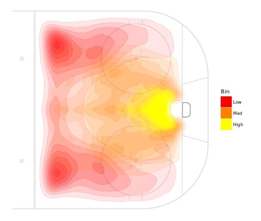
War on Ice was one of the first stat sites to really begin to break down their data into zones. They assigned each area of the ice a danger score of low, medium, or high. As a result, each player had a low danger shooting percentage, a medium danger one, and a high danger one. On the flipside, goalies had low, medium, and high danger saves as well.
(via War on Ice. Yellow = low danger. Red = medium danger. Blue = high danger)
Danger regions shed some interesting light on shooting phenomenon, such as which defensemen were more likely to pinch down from the point and shoot a medium danger shot instead of a low danger one. However, the real use of these stats came in the realm of goalies, as even strength high danger save percentage is still one of the best predictive stats available for netminder’s future performance.
Don't like ads?
Corsica took another pass at the data and further refined the definition of low, medium, and high danger chances. The full methodology can be found here, but the updated bins now look like this:
Scoring Chances: Another area that translates very well into traditional hockey-speak is scoring chances, or grade-A opportunities for a team to score.
Building off of danger zones, low danger shots are given a 1 value, medium danger are a 2, and high danger are a 3. If the shot was taken within 4 seconds of any event on the other end of the ice, it’s considered a “rush” shot, and a +1 is added. If the shot occurs within 3 seconds of prior shot, it’s considered a “rebound” and another +1 is added. If the shot is listed as blocked, then it gets a -1.
Once they’re added up, a scoring chance (SC) is anything with a 2 rating and above. A high danger scoring chance (HDC) is a 3 rating and above.
It should be noted that Corsica has their own method for determining scoring chances using expected goals. However, Natural Stats Trick still uses this WoI definition.
Expected Goals (xG): describes shot quality by looking at Fenwick events and their:
Don't like ads?
- shot type as reported by the NHL (wrist shot, slap shot, backhand, snap shot, deflection, wrap-around)
- shot distance
- shot angle, measured from the center of the net
- if the shot was a rebound or a rush
- if it was on a player’s strong side of the ice
- if it was taken at even strength or on the power play
Through some computer-based regression modeling, the likelihood that a shot with each of those factors would become a goal is calculated. In the end, if you add up all of those values for a player’s shot total, and you’d get the number of goals he statistically should be expected to score based on his shot quality.
While Score/Venue Adjusted Corsi is still the best predictor for future team goals, xG is a better predictor for individual skaters.
One of the best ways to get a working understanding of this stat is to check out the TEAM and MATE visualizations at Dispelling Voodoo. TEAM focuses on team’s Corsi, xG, and goals. It shows game-by-game counts and rolling averages, plus xG PDO and some special teams work. MATE does the same thing for individual players, including the season trends, relative performance to teammates, and individual rates vs. NHL averages.
Everything is colorcoded and has a hover label. Instead of digging through charts, both visualizations are great for getting a birds-eye view of these stats and how they flux and change over the season.
Fun Visualizations:
Hockey Viz: This entire website is a treasure trove of graphs and information. It’s run by Micah Blake McCurdy (the inventor of score/venue adjustment), and it has quick and easy-to-grasp diagrams on nearly ever term talked about today.
I’d suggest starting on the how-to page. It explains what each of the graphs mean in fairly straight-forward terms. After that, each team has overall data and links to each player’s individual year and career visualizations.
Don't like ads?
Game Score: Developed by Dom Luszczyszyn, Game Score is the hockey version of a basketball stat under the same name. He weighted goals, assists, shots, penalties, faceoffs, Corsi, and on-ice goals for/against, then added them up to provide a ranking for figuring out who had the best game that night.
Game Score also can be applied to players over their full season or career. It allows them to be put in depth charts, like this one, that provide a ballpark of quality of various players within the lineup. 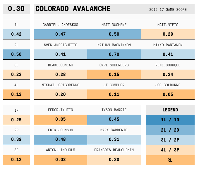 It can also be used to look at which team is more likely to win a matchup based on their depth chart and power ranking. It’s obviously not always right, but it does quantify which team is more likely to win that night than the other.
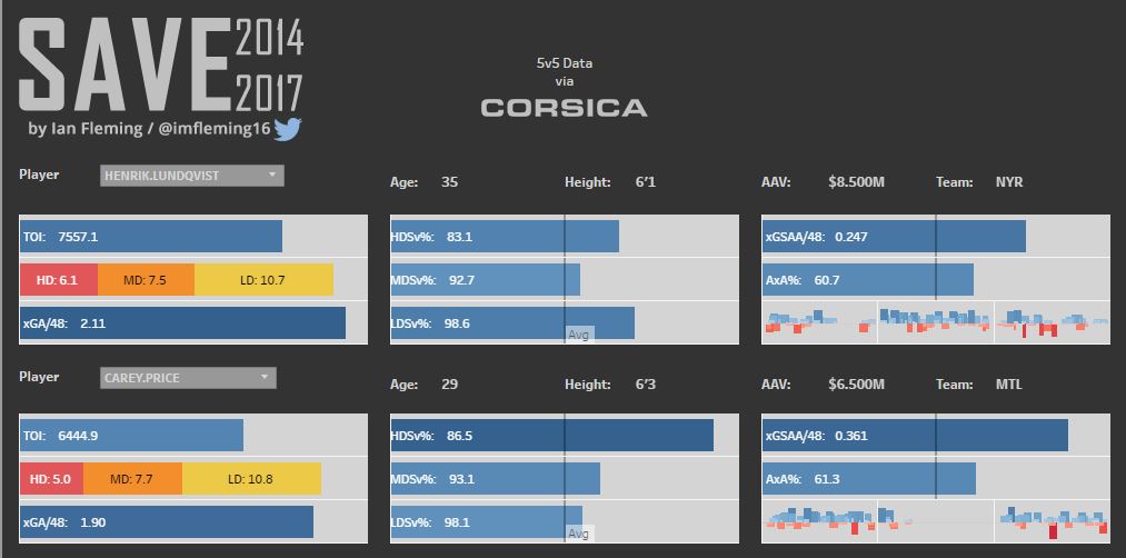
SAVE (Statistical Analysis of Voodoo Elements): In part 1, HERO Charts were introduced, allowing for quick snapshot comparisons between skaters. SAVE Charts are the same idea for goalies. They look at shots and save percentages based on danger zone, as well as expected goals against over the past three years. Goalies performances above average and above expected are also shown in bar forms, as well as game by game results.
Comments
Share your thoughts
Join the conversation
The Comment section is only for diehard members
Scroll to next article
Don't like ads?
Don't like ads?