© 2026 ALLCITY Network Inc.
All rights reserved.


Introduction
If you’ve been around hockey the past few years, you’ve probably heard about advanced statistics. Unfortunately, wading through the “our math matters!” and “watch the game, nerds!” debate to actually figure out what the stats are hasn’t always been the easiest process.
Even if you manage to find the research, it’s often difficult to parse how that number soup relates back to the ice. Much of it is dense with jargon, so it’s easy to understand why most of these stats haven’t been part of the mainstream media conversation.
To be sure, if you’re interested in learning about hockey stats, there are some great resources out there, but many are hard to find and outdated. Stats websites have come and gone, and NHL.com’s numbers have been anything but accurate. It’s not an easy world to break into, especially if you don’t know where to begin.

That’s what this guide comes into play.
It’s broken into three parts: basic, intermediate, and advanced. Why such a breakdown? Because you don’t need stats to enjoy hockey. Knowing a team is getting outshot doesn’t take away from an awesome breakaway goal. A goalie’s high danger save percentage doesn’t minimize that crazy glove save he just made. A team’s PDO doesn’t make a win any less sweet.
Stats are a tool, but they’re a tool without much human bias. They level the playing field, but they’ll never be able to tell the full story. In some ways, they’re the opposite of scouting, which is what makes them valuable.
Don't like ads?
When the two methods are combined, they create a much clearer picture of the team or player in question. They cover for the weaknesses in each other, and are ideally are taken in tandem when doing any sort of analysis, especially in a sport like hockey that’s so difficult to break down and quantify.
But not everyone wants to look at the stats. And that’s okay. All stats are a rabbit hole, and if you’re a casual fan that probably won’t be having a longwinded debate about which 4th liner is superior to another, then something like the expected goals for (xGF) or goals above replacement (GAR) stat might not be for you.
This guide is meant to be a choose your own adventure exercise, allowing you to dig as deeply as you’d like, but presenting it in a straightforward way that directly relates back to on-ice play.
This first installment, the basic guide, will cover more mainstream stats (like Corsi and PDO) and buzzwords that might show up on broadcasts or in articles. The intermediate guide builds on that knowledge and focuses on stats websites like Corsica, Natural Stats Trick, and PuckIQ and the questions they can help answer. Finally, the advanced guide will look at where stats research is headed, including microstat projects and composite rankings.
These articles are meant to be an introduction, so if there are questions, please ask. While many of these ideas are fairly straightforward, there are some that may seem counter-intuitive at first. Understanding them isn’t always easy, but once you do, they open up a whole new understanding of the game.
So, without further ado, let’s break down some hockey stats.
Don't like ads?
Key Concepts
Note: This article will focus on the NHL because it has the most data available, but these terms are applicable for any level of hockey.
When you say “Traditional Stats”, which ones are you talking about?
For the purposes of this guide, traditional stats are: Goals, Assists, Points, Shots, Shot Type (wrist, slap, wraparound, etc.), Shot Distance, Shooting Percentage (s%), Saves, Save Percentage (Sv%), Goals Against Average (GAA), Blocks, Misses, Hits, Takeaways/Giveaways, Penalties in Minutes (PIM), Time on Ice (TOI), and Plus Minus (+/-).
Most of them have been around forever, and they’re directly tracked by the NHL, and the vast, vast majority of so-called “advanced stats” are based directly on them.
So where do these advanced stats come from?
The raw data for stats sites – especially those available publicly – comes from NHL play-by-play, event summaries, and game summaries like these. They’re released after every game and available as a link in each NHL recap, so stats sites scrape the numbers and use them as their database.
Don't like ads?
Private analytics companies do their own tracking, but those numbers are really only available to certain NHL teams, agents, and broadcast partners. Most newspapers, online articles, podcasts, and other sources use the public scraped data sites.
Predictive vs. Descriptive and the whole point of advanced stats:
It’s not a distinction that’s talked about much, but there’s subtle but important difference between descriptive and predictive stats.
- Descriptive stats state what happened in the past, such as Mikko Rantanen scored 20 goals last season.
- Predictive stats try to forecast what will happen in the future, such as how many goals Rantanen will score this year.
This seems really straightforward, but it’s critical to understand because the vast majority of hockey analytics boils down to figuring out how to turn descriptive stats into predictive ones.
Most stats we’ll be talking about in this guide are a mix of the two, but some are better predictors than others. For a stat to be predictive, it needs to A) have enough events to filter out weird bounces and other statistical noise, B) has to be relatively repeatable player-to-player and year-to-year, and C) actually relate back to what’s happening on the ice and winning hockey games.
For example, goals are a great descriptive stat, but goal totals can vary quite a bit between seasons. They’re influenced by a lot of outside variables (like teammates, special teams, ice time, goalies, etc.), and a sizable percentage of them are based on hot streaks or chaotic plays. Compared to other stats, there aren’t many goals in each game, so it takes a lot of time to get a sense of the talent rather than the luck of the player.
Don't like ads?
For these reasons, there are actually other stats that do a better job of predicting future goals than past goals.
This may seem counter-intuitive, but process stats are often more predictive than outcome ones. If a player is shooting the puck, the goals will eventually come. There are usually more than 10 times as many shots in a game as goals, so fluky plays count for less within the data set. Also, a player has more control over choosing to shoot the puck than whether or not it gets past the goalie, so the number is closer to a repeatable skill.
So, even though shots are a descriptive stat – this player had x number of shots – they’re also more predictive of goals than goals. Adding in missed and blocked shots further improves the number, and adding in other context factors bumps it even more.
However, as stats get more predictive, they move further and further away from what’s happening on the ice. You can easily point to a goal and say “that’s a goal”. Pointing to a shot and saying “that’s worth .78 adjusted Corsi” isn’t something you’ll be doing at a game (I hope). Also, there’s a 100% chance that descriptive stats happened, while there’s only a probability that predictive stats will ever truly relate back to the ice.
In the end, it all comes down to the question you want answered. Descriptive and predictive stats each have their place, but by expanding our understanding of what happened in the past, it gives us a better chance to predict the future.
Understanding Unsustainablity/Regression to the mean:
Don't like ads?
Since most of this guide will be focused on predictive stats, there are a few key concepts that will consistently come into play with that kind of analysis.
The first is regression.
Have you heard a player talk about not getting to high after a win or too low after a loss, trying to ride a hot streak while it’s here, or keep doing the little things to break out of a slump? In hockey stats, the buzzword “regression to the mean” is much the same concept. Hot streaks and cold streaks happen, but if given enough games, everything will eventually average out to around a player’s true talent level.
The area where you hear “regression to the mean” and “unsustainable” the most is with shooting percentages. If a player starts the year scoring a ton of goals while sinking 25% of his shots, that should be a strong indication he’s on a hot streak that will eventually end. Likewise, if a player has 100 shots and zero goals, that’s also likely to change soon.
Even though some players have a higher shooting percentage than others over the course of their careers (like Alex Tanguay), most players shoot around 7-9%. As discussed earlier, goals depend on a lot of factors players can’t control, so outliers to this rule are very rare. Assuming a player is an outlier based on a few games or even a season is very risky business, because the chances of him being able to repeat it constantly are very low. Play enough games, and he’ll hit highs, lows, and a whole bunch of middles. Average it all out, and he’ll likely end up right around the league average (plus or minus a bit based on playing time).
There’s a lot of random chance in hockey. Embrace it, ride it, but know there are only so many times you can flip heads or tails in a row.
Don't like ads?
Sample size:
Sample size is another key term to keep in mind when looking at predictive stats. Numbers can only be evened out by regression over a long period of time. If you’re looking at a shot period of time, say 10 games, the data is probably heavily colored with hot and cold streaks, random bounces, and other odd situations that will throw it off.
Trying to make a prediction based off that is like looking at a target with wildly spaced arrows and attempting to suss out the middle of the cluster. It involves a lot of guesswork and gut decisions, and it’s not very accurate or repeatable. But if you keep firing arrows, the middle becomes a lot easier to find, and chances are good that the bulk of your arrows will end up at or near the middle of it.
Our current hockey stats aren’t great at short term analysis. They can tell you in the end, outshooting your opponents will bring you more success than failure, but it won’t stop a team from losing a string of games in a row. They can tell you “over the longer term, Goalie A is likely to be better than Goalie B in these areas, so Goalie A has a higher probability of helping you win”. But if Goalie B is on a hot streak, it might make more sense to play him until he cools off instead.
Over a long period of time, these stats are pretty darn accurate. They’ve been tested on data from the last 10 seasons, and they’ve been studied, altered, updated, and replaced. It’s an ongoing process and will never be 100% predictive, but over enough games, these numbers are worth believing.
In the short term though? Eh. Take them with a big grain of salt.
Why +/- is terrible:
Don't like ads?
Plus minus is a rating that rewards a +1 anytime your team scores a (qualifying) goal while you’re on the ice, and gives you a -1 when the other team does. Traditionally, it’s used to talk about how strong a player is defensively, and it’s been officially recorded since 1967-’68.
It’s also the one thing that will make stats people hiss if you use it in a conversation.
Up above, we discussed how goals are influenced by a lot of outside factors and random bounces. Well, plus minus is an entirely goal-based stat. It is highly influenced by who your teammates are and whether you’re on a good or bad team. It’s also somewhat arbitrary, as it includes situations where the goalie is pulled and short-handed goals while excluding power play tallies. A +5 also doesn’t tell you if the player is +5/-0 or +50/-45, which are two very big differences in performance.
Even though modern stats still have a somewhat hard time of quantifying how good a player is at defense, plus minus is still deeply flawed. When someone’s +/- is really, really bad or really, really good in comparison to a player’s teammates over a multi-year span, it’s worth talking about. (Yes, Jack Johnson, we’re talking about you). Otherwise, plus minus is a stat that doesn’t actually tell you what it’s believed to tell you, and there are similar stats out there that will provide a better predictive value.
So, what should us use instead?
Basic Hockey Stats
Corsi (or Shots Attempts (SAT)): is a better form of +/- that measures shot attempts, including shots on goal, blocks, and misses.
Don't like ads?
Since it’s a shot-based stat, it draws on a much larger sample size than traditional plus/minus. This bigger data pool allows for more regression over a shorter amount of time, which provides a more accurate sense of who is getting outplayed. This is not a be-all-end-all stat by any means, but it does help point out players who drive offense vs. those who struggle defensively.
It was originally used to chart goalie workload by a goalie coach named Jim Corsi, and it can be expressed in +/- or percentage format. Nowadays, it’s typically used to describe puck possession, or which team had the puck for a longer amount of time.
The fact that Corsi corresponds very strongly with time of possession is a well researched coincidence, but it does make some sense. If one team is shooting more, they A) definitely have the puck, B) are actively trying to score and C) are far away from their own goalie and therefore are less likely to be scored on. Over the long term, this typically means more goals and more wins.
Basically, Corsi is not only how good a player/team is at keep-away, but also how likely they are to do something useful with it.
If you’re more of a visual person, this video also does a good job of breaking the concept down.
Fenwick (Unblocked Shot Attempts): Named after blogger Matt Fenwick, it’s Corsi without the blocked shots. In the beginning, it was thought blocking shots might be a talent, but we still haven’t been able to consistently prove they affect the numbers. What we do know is that the NHL tracks the location of blocks NOT the blocked shots, so there are situations where that data needs to be thrown out entirely.
Don't like ads?
If you’re looking at possession or which team is more likely to win, stick with Corsi. You don’t need to know where a blocked shot came from to see a team was trying to score.
Fenwick correlates better with scoring chances, but in its raw form, it’s pretty useless. It needs other variables added in before it can tell us much.
At this level, just know Fenwick exists and is essentially Corsi-lite.
Primary Points: goals and first assists only. Second assists have two issues: 1) they’re somewhat arbitrarily awarded and 2) they’re a bit of a passenger stat, since they may or may not have a direct impact on the play that creates the goal. Either way, they’re not very repeatable year to year, so tossing them out gives you a better sense of the true talent level of a player.
PDO: Luck tends to be regarded as a bad word in sports, because it implies to some that success wasn’t earned. However, it’s hard to deny that there’s a lot of random chance, weird bounces, and hot and cold streaks in the NHL. Since we know that everything tends to even out over enough games, can we measure if a team is getting “lucky” or “unlucky” in the short term?
A blogger who went by the screenname of PDO came up with a solution. The PDO stat adds your goalie’s save percentage while you’re on the ice to you and your teammate’s shooting percentage while you’re on the ice. If those two numbers don’t add up to 100 percent, chances are good someone on your team, or on an opponent’s, is on a hot or a cold streak.
Don't like ads?
It could be your goalie playing lights out, or it could be you (or your teammate) shooting at 25 percent. Either way, sooner or later you’ll regress to the mean and your good/bad luck will run out.
The best way to think of PDO is as a warning flag. It can’t really tell you what’s wrong – you have to do a bit more digging to find that out. However, if it’s lower than 99 or higher than 101, something is off and correction is probably coming very soon.
Zone Start: a look at who was on the ice for each faceoff and whether that faceoff was in the offensive, defensive, or neutral zones. Since coaches usually have the ability to decide who those players should be, it’s a way to measure how offensively or defensively a player is deployed.
A 60% zone start indicates the player started 60% of his faceoff shifts in the offensive zone and 40% in the defensive or neutral zone. Unfortunately, it’s very difficult to quantify the situations around on-the-fly shift starts, which represent 60% of the zone starts of an average NHL player, so there’s only so much zone starts can tell us about overall usage.
Also, bad players tend to allow the opposition more shots on their goalie, more puck freezes, and therefore more defensive zone starts in the middle of their shift. If a player has poor possession stats and a high defensive zone start, it might not mean he’s getting all the tough minutes from his coach; he might be creating the tough minutes for himself.
Fun Visualizations & Resources:
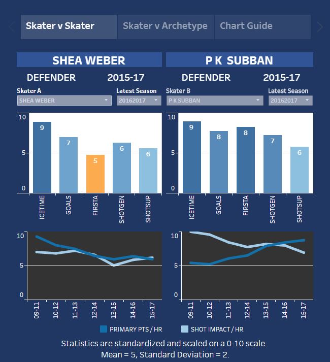
HERO: HERO charts rank all the top 420 forwards and 210 defensemen in five categories: ice time, goals, first assists, shots generated, and shots suppressed. They allow you to quickly look at the strengths and weaknesses of a player, compare them to other players, or compare them to an average 1st line winger, 3rd pairing defenseman, etc. They’re great for a quick snapshot of how each player is preforming.
Don't like ads?
Shift charts: Who was on the ice against each other? Shift charts allow you to see matchups, linemates, who was on the ice for goals for and against, and how long each shift lasted. You can even hit the play button and watch the substitutions happen.
Comments
Share your thoughts
Join the conversation
The Comment section is only for diehard members
Scroll to next article
Don't like ads?
Don't like ads?